
Neutral interiors are popular because they feel calm, flexible, and easy to update. Shades such as white, cream, beige, grey, and soft brown create a clean foundation that works with many decorating styles. However, when every surface uses similar tones, a room can sometimes feel flat or unfinished.
A carefully chosen rug can solve that problem without changing the entire colour scheme. Pattern, texture, shape, and subtle colour variation can give a neutral room more character while preserving its relaxed atmosphere. The aim is not to overpower the space, but to introduce enough visual interest to make it feel considered and complete.
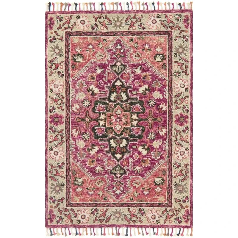
Let Loloi Rugs Become a Focal Point
Homeowners exploring Loloi rugs can use the rug as the main decorative feature in an otherwise restrained room.
When walls, sofas, and larger furniture pieces are neutral, the floor offers an opportunity to introduce more personality. An abstract design, geometric pattern, or softly distressed look can add movement without requiring bright colours throughout the room.
The rug does not need to contain dramatic shades. Even a combination of cream, charcoal, muted blue, or warm brown can create enough contrast to keep the interior from appearing plain.
Once the rug becomes the focal point, surrounding accessories can remain relatively simple.
Use Texture to Add Depth
Neutral rooms benefit greatly from texture because it creates variety without introducing too many colours.
A rug provides one of the largest textured surfaces in the space. From there, other materials can be layered gradually. A linen sofa, wooden side table, woven basket, ceramic lamp, and soft cushions can all contribute to the room without making it feel cluttered.
Try combining:
-
smooth and textured fabrics
-
natural wood with softer surfaces
-
woven accessories with simple furniture
-
glass or metal details with warmer materials
-
different neutral tones rather than one identical shade
These contrasts make the room feel richer while maintaining a calm visual direction.
Build Contrast Without Using Bright Colours
Contrast does not always mean adding red, yellow, or another bold shade.
A neutral room can create strong visual interest by combining light and dark tones. For example, a pale sofa placed above a deeper grey or brown rug can give the seating area more definition. Similarly, a cream rug can brighten a room with darker furniture.
The difference between warm and cool neutrals also matters. Beige and tan create a warmer atmosphere, while grey and charcoal often feel cooler and more contemporary.
Mixing these tones carefully can make the space feel layered rather than one-dimensional.
Consider Momeni Rugs for a Layered Design
When selecting Momeni rugs, think about how the design could connect different neutral shades already present in the room. A rug containing several related tones can act as a bridge between furniture, flooring, curtains, and wall colours. This is particularly useful when the room contains pieces purchased at different times.
Instead of trying to match everything exactly, choose a rug that shares a few colours with the surrounding décor. The result usually feels more natural. A pattern can also introduce movement into a simple interior without requiring additional wall decoration or numerous accessories.
Give the Rug Enough Space to Be Seen
Even an attractive rug can lose its impact if too much furniture covers it. Consider the pattern before deciding where furniture should sit. In a living room, placing only the front legs of the sofa and chairs on the rug may leave more of the design visible.
In a bedroom, position the rug so enough of it extends beyond the bed to contribute visually as well as provide comfort underfoot. The correct arrangement depends on the room, but the rug should appear intentionally placed rather than hidden beneath furniture.
Avoid Overdecorating the Room
Once a rug introduces pattern and texture, the room may need fewer accessories than expected. Adding too many cushions, decorative objects, prints, and small pieces can compete with the rug and reduce the calm quality that makes neutral interiors appealing.
A useful approach is to choose only a few supporting elements:
-
one or two cushion styles
-
a simple throw
-
limited artwork
-
a plant or natural element
-
carefully selected lighting
Leaving some empty visual space allows each decorative choice to have more impact.
Keep the Overall Palette Connected
Neutral does not mean every item has to be the same shade. In fact, rooms often look more interesting when several related colours are used together. Cream, beige, taupe, grey, brown, and black can all coexist when they are repeated thoughtfully. Use the rug as a reference point. Pick one or two of its shades and repeat them in smaller details elsewhere. This creates continuity without making the room appear overly coordinated.
Conclusion
Neutral interiors provide a versatile foundation, but they still need texture, contrast, and personality to feel complete. A rug can introduce all three while allowing the room to remain calm and balanced. Focus on pattern, tonal variation, texture, and thoughtful furniture placement rather than filling the space with extra decoration. A strong rug can do much of the visual work on its own.
When the floor, furniture, and accessories support one another, a neutral room can feel warm, distinctive, and carefully designed without relying on bold colour or unnecessary clutter.
